How to Analyse Trends Using Bitcoin Price Charts?

Bitcoin is a digital currency, otherwise known as a cryptocurrency, which allows people to both send and receive money via the Internet. It has boomed in popularity over recent years due to its high level of volatility – with values fluctuating hourly, many shrewd investors have managed to make their millions by identifying trends in this unpredictable market.
How To Buy Bitcoin:
Some people are put off by the seemingly complex process of purchasing Bitcoin. First, you will be required to set up a digital “wallet” in which to store your currency. You will then be able to purchase currency from a Bitcoin trader online, paying for it by credit card or through a platform such as PayPal. Unfortunately, horror stories of scam sellers are rife, which has a tendency to act as a drawback for some. If you want a service that allows you to purchase Bitcoins for cash from a reputable trader, then you can visit Bitcoin Dealers to buy Bitcoin in Melbourne.

Assessing The Value:
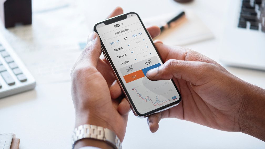
Although it’s easy to take a quick look online to find out the current price of Bitcoins, attempting to work out where they’re headed is a little more complex. Nevertheless, as a currency that fluctuates so wildly, Bitcoin owners are sure to want to keep an eye on where it’s likely to be headed so that they can make the most of their investment. This can be done by analysing price charts.
The Best Bitcoin Price Charts:

Although the more involved you get, the more complex the price charts become, there are certain essentials that every newcomer must get their head around from the beginning. For starters, a basic line pricing chart provides a handy tool that’s easy to understand. These charts consist of a coordinate graph with a timeframe on the x-axis and a value on the y-axis. The timeframe can be anything from a period of one month or one week, to more intricate periods of days or hours. The value usually consists of a standard currency such as US dollars. The line will indicate the closing value of 1 Bitcoin at a given time.
If you are ready for something a little more complex, then why not take a look at candle charts? These pack a lot more information into a similar format. With the standard line graph showing closing prices, candle charts offer additional data on the opening prices, allowing you to visualise the highest and lowest values that occurred in a particular time period. These charts give you the chance to see whether prices have risen or fallen and by exactly how much, both across a longer timeframe and within smaller segments of that period.
Once you’re really getting into it, you may want to take a look at column volume charts. These do not convey the price of the Bitcoins but instead, reveal how many individual coins are being traded at any given moment.
Reading Bitcoin Price Charts:
When reading Bitcoin price charts, it can be a little hit and miss. However, the main thing to look out for is an abnormal spike in the chart – what could have been the cause of this? A number of external factors could be tied to these changes, such as major transactions in the Bitcoin world, or public events or media stories that are causing people to sell.
By analysing the data and attempting to identify the cause, you can begin to understand what aspects have a knock-on effect. You may then be able to predict any changes that might occur in the near future.
Read Also:


Leave A Reply